Gloria FurnitureDesign study · 4 min read
A furniture shop organised around the room.
A furniture storefront concept connecting room-led browsing, product comparison, and purchase actions.
Read the case study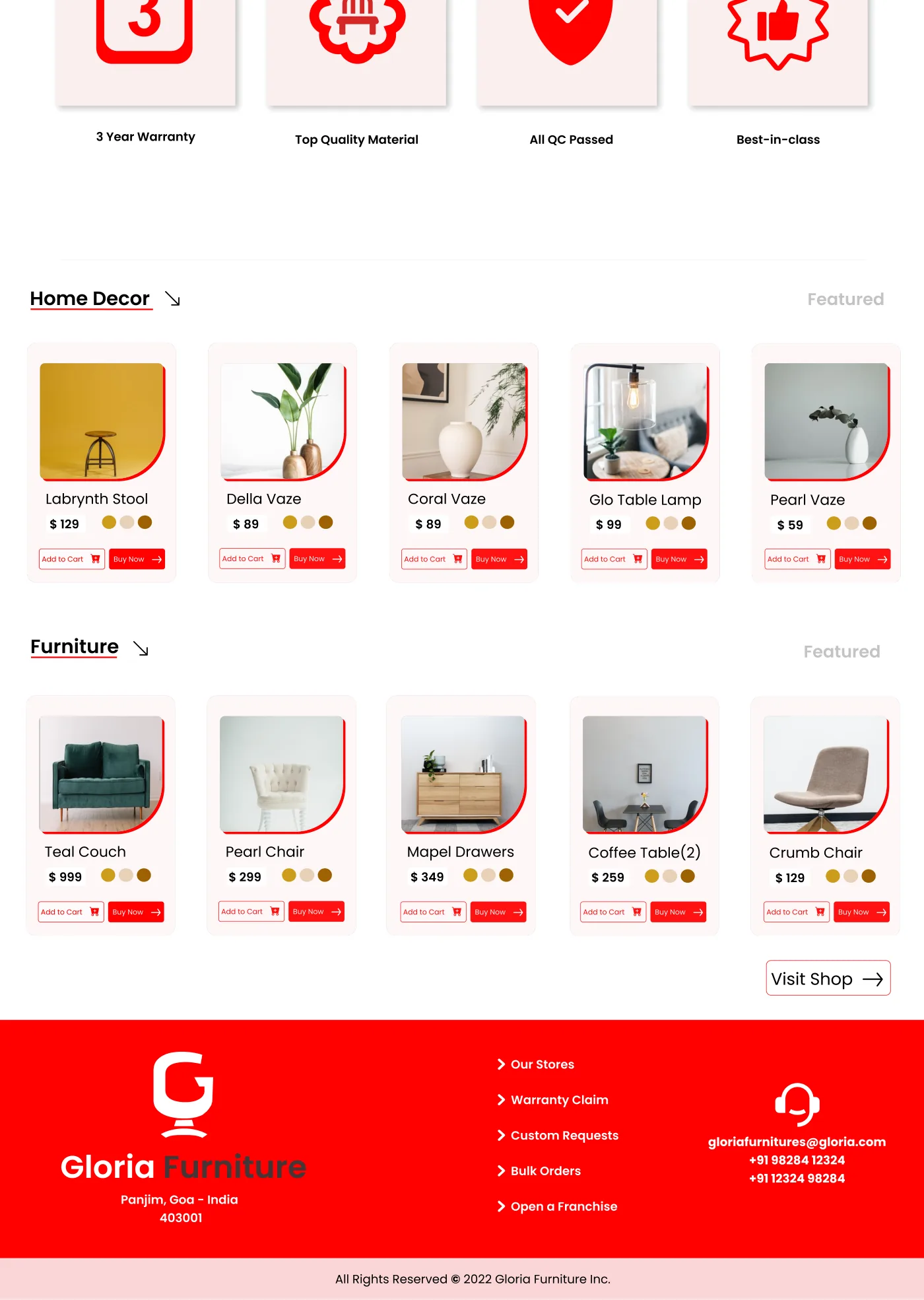
Repeated product cards carry the browsing pattern through to purchase actions.
View full size ↗01 The problem
How does visual browsing become a useful buying decision?
Furniture is both a visual and a practical purchase. The original Gloria concept tries to support inspiration at the top of the page, category exploration in the middle, and concrete products with prices further down. The design question is how to make those modes feel like one useful shopping path.
Designed for Furniture shopper making a shortlist. Find a relevant collection and enough detail to continue.
User context Design assumption
Browsing room inspiration and comparing categories.
- The friction
- A visual catalogue can leave practical questions unanswered.
- Design implication
- Connect inspiration to categories and a next product decision.
Example situation · illustrative scenario. Imagine finding a piece of furniture you like, then asking whether it fits the room, the budget, and the practicalities of buying it. A storefront has to support both kinds of attention.
02 The outcome
A catalogue organised around the room.
I designed a storefront landing page that moves from room inspiration into categories and comparable product cards. Prices and service information sit alongside the imagery so browsing has a practical direction. The artifact is a visual concept; it does not include a working checkout.
More about the experience
- Category-led discovery. The upper page offers ways into the catalogue.
- Repeated product cards. The lower page carries names, prices, and actions in a consistent pattern.
03 Research & direction
Inspiration needs a route
The concept moves from inspiration to categories to comparable products. That sequence is the useful foundation; dimensions and fulfilment would make the next step stronger.
Original storefront concept
- 2
- featured product groups
- Category-led
- browsing
- Concept
- no sales results recorded
My direction. I organised the retrospective around how the page narrows a shopper’s options, then identified the information still needed to support a purchase.
More about the original process
The surviving PDF is a single long storefront design, not a research report. I reviewed its hero, category imagery, quality messaging, product cards, and service links to make the underlying structure explicit. The archived dollar prices, warranty copy, and contact details are sample storefront content, not verified business facts.
This is a retrospective reading of the design. The available artifact does not establish customer interviews, a checkout implementation, or commercial performance.
- Explore
Start from an image or a category.
- Compare
Use a repeated card pattern to scan options.
- Decide
Bring practical product and delivery information into the next step.
04 Design decisions
Help shoppers compare a collection.
Open a decision to see the reasoning and trade-off.
01Start with inspiration, then offer more specific choices
The hero leads into visual categories before the featured Home Decor and Furniture groups.
Why this matters. A shopper can begin with a broad interest and progressively narrow to a product, instead of meeting a full catalogue immediately.
The trade-off. The path would need descriptive category labels and accessible images; atmosphere alone does not tell a shopper where to go.
02Make product cards comparable
The featured groups repeat name, price, image, Add to Cart, and Buy Now treatments.
Why this matters. A stable card structure supports scanning across products and makes purchase actions predictable.
The trade-off. Two equally prominent purchase actions can compete. Today I would test a primary product-detail path before offering immediate purchase everywhere.
03Keep practical reassurance near the shopping journey
The concept includes a quality band and footer links for stores, warranty claims, and custom requests.
Why this matters. Furniture decisions often require service and fulfilment information as well as appealing photography.
The trade-off. Those claims need real policies and product information. The visual concept alone cannot establish quality or a working support service.
05 Reflection
A beautiful product card should help someone decide what to do next.
I would next add the details someone needs before buying furniture: dimensions, materials, stock and delivery coverage. Those are more useful at this stage than another promotional section.
What I would evaluate next proposed work
- Proposed task: find a product within a budget, compare two options, and explain delivery expectations. Record missing information as well as completion.
- build a product-detail page and a narrow-screen catalogue, using real product data and one clearly prioritised action.
Choosing a boat before making an enquiry.