Steve WilsonDesign study · 4 min read
Let the work lead the portfolio.
An early portfolio concept exploring typography, project browsing, and a repeatable case-study template.
Read the case study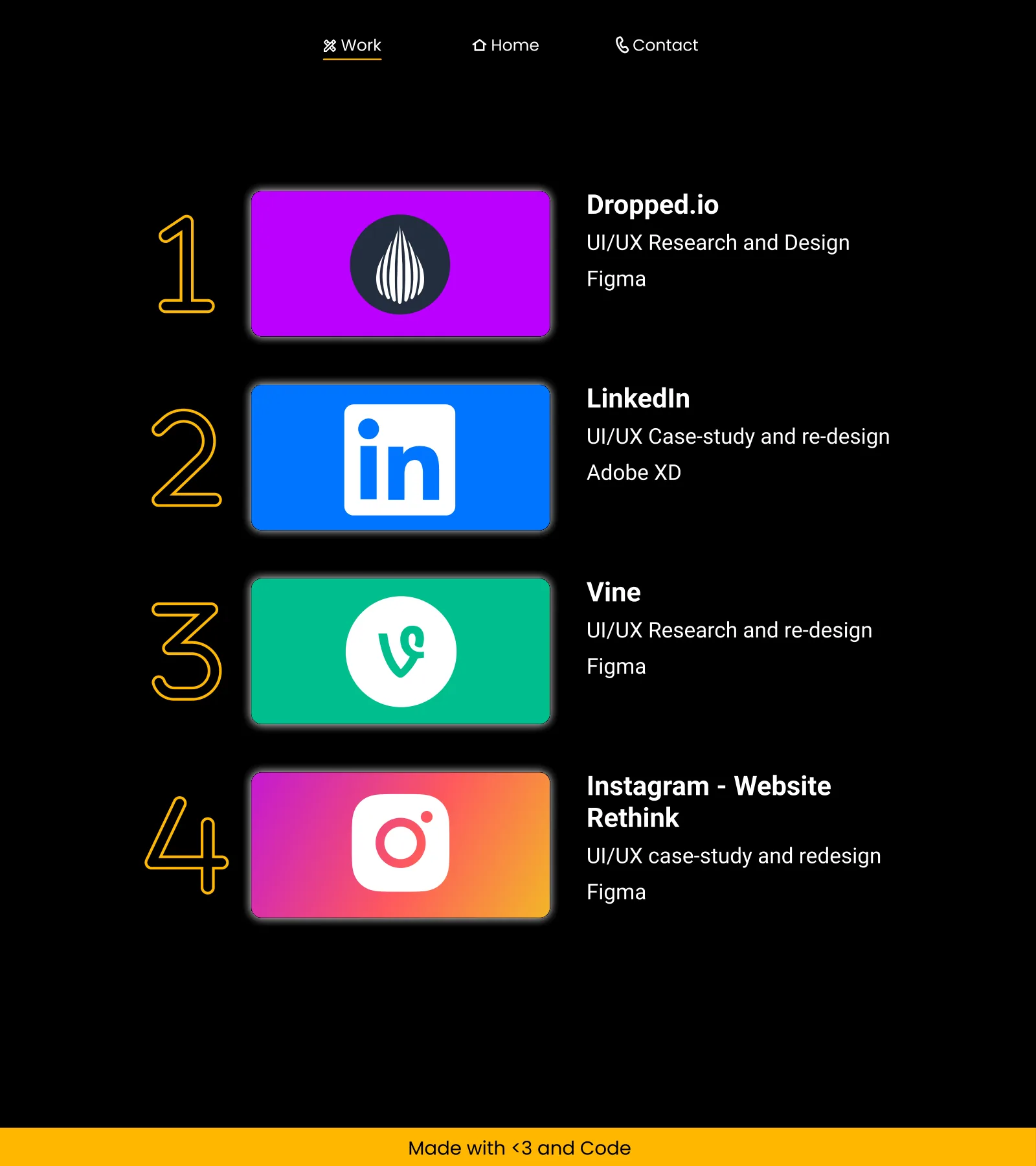
The work list keeps project browsing separate from the longer case-study template.
View full size ↗01 The problem
What makes someone want to move from a first impression into the work?
A portfolio has to communicate what a designer does, offer a convincing sample of their work, and make contact straightforward. This early concept uses the fictional Steve Wilson identity to explore that sequence through a home page, work listing, project-detail template, and contact destination.
Designed for Prospective client reviewing a portfolio. Understand the designer’s offer and inspect a suitable example.
User context Design assumption
Scanning for relevant work before deciding whether to make contact.
- The friction
- A polished introduction alone does not explain the work.
- Design implication
- Move quickly from identity to selected projects.
Example situation · illustrative scenario. Picture a reviewer opening a designer’s portfolio between other applications. The first page has to establish what the designer does and make one relevant project easy to choose.
02 The outcome
A strong front door, with depth still to add.
I designed a homepage, work index, project-detail template and contact page around the fictional Steve Wilson identity. The exercise helped me explore the difference between scanning a body of work and reading one project closely. Names, client credits and result figures in the original template are sample content.
More about the experience
- A type-led opening. The name treatment establishes the visual entry point.
- A separate work index. Projects can be scanned before opening the longer story.
03 Research & direction
The useful signal
The original concept already separates browsing from deep reading. Its project template creates room for a story, but that room still needs real decisions and evidence.
Original visual concept
- 3
- page types
- Type-led
- visual direction
- Concept
- not a client engagement
My direction. I used the retrospective to connect the visual hierarchy to the reviewer’s sequence: orient, select, investigate, then make contact.
More about the original process
The available evidence is a four-page visual artifact, including a long project-detail template. It contains sample copy, mock project names, placeholder results, and a sample client attribution. Those are layout content, not my client history or achieved results.
I organised the pages so that the introduction establishes the designer’s role, the work listing exposes project categories and tools, and the detail template reserves space for the problem, process, outcome, and lessons. No original research or testing record accompanies it.
- Orient
Understand the designer’s role.
- Choose
Scan a focused work index.
- Investigate
Open a project with room for contribution and process.
04 Design decisions
Lead from the work into the case study.
Open a decision to see the reasoning and trade-off.
01Use typography to establish the first impression
The concept combines a large name treatment with a restrained dark background and a bright accent.
Why this matters. The visual hierarchy gives the identity a clear point of entry before visitors scan services or projects.
The trade-off. A strong name treatment cannot replace useful positioning copy; I would make the designer’s particular value more specific.
02Separate browsing from deep reading
The work listing acts as an index, while project details have a longer narrative structure.
Why this matters. Visitors can skim the portfolio before deciding which story deserves more attention.
The trade-off. A listing only helps if its labels explain the work rather than relying on unfamiliar project names.
03Give each project the same narrative spine
The template includes role, problem, process, results, takeaways, and final product.
Why this matters. A repeated structure helps a reviewer compare contributions across projects.
The trade-off. In the archive, much of that structure is empty sample content. A template is useful scaffolding, not evidence of a completed case study.
05 Reflection
The layout earns attention; the evidence earns confidence.
I would keep the clear browsing structure and rewrite the project pages around actual decisions. A well-proportioned template is useful, but the writing and evidence inside it are what make a portfolio convincing.
What I would evaluate next proposed work
- replace the sample project with one real story, then test whether a reviewer can identify the role, central decision, and outcome in a short scan.
- verify contrast, keyboard navigation, responsive reading order, and a concise contact path before implementation.
A furniture shop organised around the room.